Chrome DevTools for Responsive Web Design
The requirements placed on websites have increased drastically in recent years. While browser compatibility was a cause for headaches in the past, today the issue is the wide range of end devices: Smartphones, tablets, netbooks, smart TVs, etc. entail new challenges. Loading time, RAM utilization, display, resolution, user experience and input devices have to be coordinated on all these communication channels.
The result: complexity challenging not only developers and designers, but their tools too. It is very easy to lose track of and control over the website. In this post, I would like to show you how you can get back on track and regain control with the Device Toolbar in the Google Chrome Developer Tools.
What is awaiting you?
- Behind the Curtain – Opening the DevTools and switching to Device Mode
- Let me take a Selfie – Taking screenshots and full-page snapshots
- Game of Screens – Debugging media queries, retina and srcset images
- USB Puppet Master – Remote debugging for President
- 50 Shades of Chrome
Behind the Curtain
Opening the DevTools and switching to Device Mode
To be able to use the Google Chrome Developer Tools, or DevTools for short, you will need the Google Chrome browser. The DevTools are always provided with the desktop version of the browser. You can open them using the key combination CTRL+SHIFT+I or F12 (Mac: Command+Option+I). Once you have opened them, an additional area should open that looks something like this:
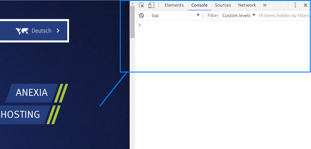
To switch to the Device area, use the following key combination: CTRL+SHIFT+M (Mac: Command+Option+M). Once this is done, the “Toggle Device Toolbar” button should flash. From GREY to BLUE (by the way, the button is next to the “Elements” label. You can click it to switch between the Device toolbar and normal mode.)
The Device toolbar allows you to configure the device emulator as often as you’d like.
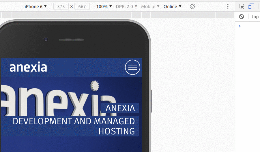
The options from left to right:
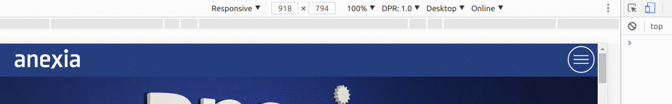
- Device Menu/Mode: Here, you can select preconfigured devices or switch to responsive mode and manually set the resolution.
- Width/height: If you are in responsive mode, here you can define the desired resolution in pixels.
- Scale factor/zoom (%): Here, you can set the zoom factor and for smaller resolutions, zoom in, for example.
- DPR: Here, you can set the device pixel ratio (DPR) for your simulated device. For devices with a retina display, the @2x and @3x image resources are loaded (if available).
- Desktop/Mobile (no touch): Here, you can configure which desktop devices are equipped with a touch display and replace mouse events with touch events.
- Online/Tier/Offline: Here, you can define preconfigured loading times and simulate the loading time for your website. You can also test weak connections or even the offline version of the website.
Website Selfies
Screenshots and full-page snapshots in the browser
Google Chrome allows you to take a screenshot of the currently visible area or the entire website from top to bottom. This is especially useful if you want to show the customer different designs in different website resolutions.
You can open the drop-down menu when you are in Device toolbar mode by clicking the little menu with the three dots. This menu also features other useful functions we will come back to later.
If you are using a preconfigured device in Google Chrome DevTools and it has a device frame, this frame is included in “Capture Screenshot” mode.
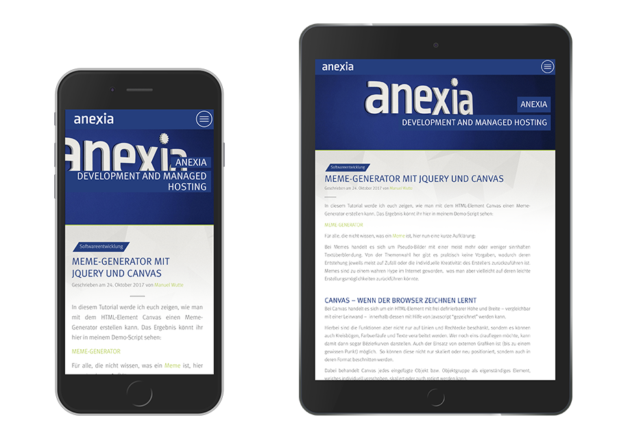
As a result, designs can be copied immediately following changes and forwarded with little effort. The devices can be shown in landscape or portrait format.
Game of Screens
“Debugging” media queries, retina and srcset images
With media queries, you can define how a document is displayed in CSS for different output media. These media queries can add up quickly and may be spread across various CSS files. As a result, the behavior in different resolutions or formats may become a real crusade. The DevTools in Device Mode allow you to work with surgical precision and Google Chrome helps you by visualizing these media queries.
The same drop-down menu where you found the “Capture Screenshot” function also contains the item “Show Media Queries”.
In the first row (in gray), you will see the most common resolutions according to Google. Clicking one of these elements automatically applies the resolution for the emulator.
The colored rows under this reveal the media queries from your CSS files. You can show where the media query has been set in your source code by right-clicking one of the colored elements. The DevTools show details for the rule definition: min-width/max-width/print or screen and the alignment – landscape or portrait.
In Device Mode, responsive images with srcset are also considered and feature useful information. Another function hidden in the Device Mode drop-down menu is showing and hiding rulers.
USB Puppet Master
Remote debugging for President
In Device Mode, we work with a so-called device emulator. This emulator attempts to approximate the conditions on the relevant devices. However, it is only an emulation and does not correspond to the end device. Here, we can access the Remote Debugging Tool. This enables us to address the Google Chrome browser on the device and receive immediate feedback. For this, you have to enable USB Debugging Mode on the device and connect it to your computer via USB.
As you can see in the screenshot, open the drop-down menu at the top right in the corner and select: More Tools > Remote Devices > then check the box next to “Discover USB Devices”.
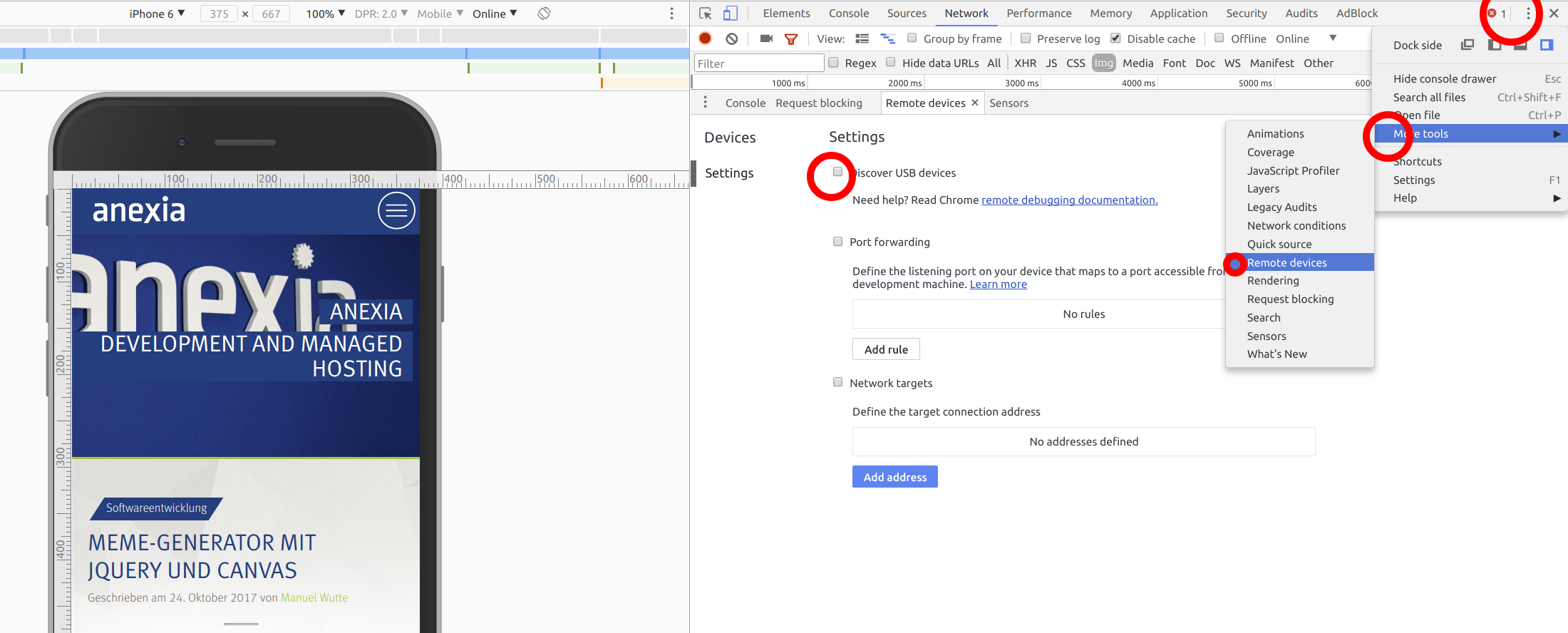
If a remote device is connected to a Google Chrome browser and all drivers are installed correctly, you can now control your device via the computer. You can now enter a target website or simply navigate to the website you want to debug using the device. All tools available in the browser on the computer are also available for the remote device.
50 Shades of Chrome
If you belong to the group of developers that work in a dark IDE, like me, then you can change the Google DevTools theme to “dark” to avoid being blinded by the light gray version.
You will find this setting in the drop-down menu in the top right corner (see screenshot) under Settings > Appearance > Theme.
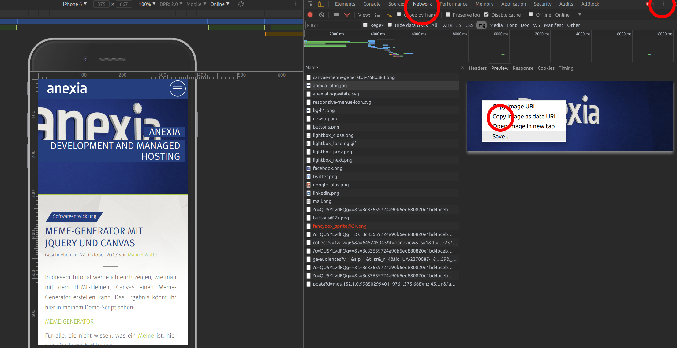
Another feature I have packed into the screenshot is the option to copy image files in the Network Inspector Panel as Base64 data URI. Those working with Base64 images will find it to be a useful feature.
Conclusion
The Google Chrome Developer Tools help developers and designers save a lot of time. With the right tools, we can gain insight into our own websites to efficiently debug their display and function on different devices.